Using SvGrid with Skeleton UI
Blend SvGrid into a Skeleton UI app by mapping its --sg-* tokens to Skeleton's theme CSS properties for consistent colors and dark mode.
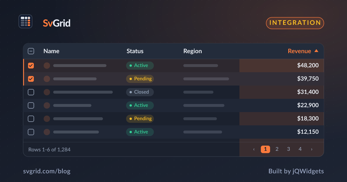
Skeleton is a popular Svelte UI toolkit built on Tailwind with a themeable set of CSS custom properties. Since SvGrid is themed with --sg-* variables, you can map it onto Skeleton's theme so the grid matches your app's look and dark mode.
Map to Skeleton's theme tokens
Skeleton themes expose surface and color properties. Point SvGrid's tokens at them:
.app-grid {
  --sg-bg:         rgb(var(--color-surface-50));
  --sg-fg:         rgb(var(--color-surface-900));
  --sg-border:     rgb(var(--color-surface-300));
  --sg-header-bg:  rgb(var(--color-surface-100));
  --sg-row-alt-bg: rgb(var(--color-surface-100));
  --sg-accent:     rgb(var(--color-primary-500));
}
In dark mode Skeleton swaps the surface scale, and because SvGrid reads everything from these variables, the grid switches with it - no extra work. See theming and dark mode.
Layout with Skeleton's app shell
Skeleton's AppShell gives you a header/sidebar/content layout. Put the grid in the content slot inside a flex container with min-height: 0 so it fills the area and virtualizes:
<div class="app-grid h-full min-h-0">
  <SvGrid data={rows} columns={columns} features={features} />
</div>
Components in cells and toolbar
Use Skeleton buttons, chips, and inputs for the toolbar and for action cells (via renderSnippet), keeping the grid body to SvGrid. The result is one consistent design language across your app.
Frequently asked questions
How do I theme SvGrid to match Skeleton UI?
Map SvGrid's --sg-* variables to Skeleton's theme tokens, such as --sg-bg: rgb(var(--color-surface-50)) and --sg-accent: rgb(var(--color-primary-500)). The grid then follows Skeleton's palette and dark mode automatically.
Does SvGrid fit inside Skeleton's AppShell layout?
Yes. Place it in the content area within a flex container that has min-height: 0 so the grid fills the space and virtualization engages, while Skeleton handles the surrounding shell.