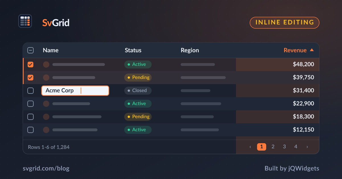
An Editable Select / Dropdown Cell in SvGrid
Build a dropdown cell editor in SvGrid using a Svelte 5 snippet - constrain user input to a fixed option set while keeping sort, filter, and undo working on the underlying value.
Free text fields in a grid are a trap. Every developer who has worked with user-maintained data long enough has found a column that contains "active", "Active", "ACTIVE", and "acitve" all referring to the same thing. For any column drawn from a fixed set - status, category, priority, assignee - a dropdown cell removes an entire class of data quality problems before they start.
SvGrid ships built-in editors for text, number, checkbox, and date columns. For a select you bring your own snippet. That is not a gap, it is a deliberate design: a generic <select> built into the grid would be less flexible than one you write yourself in ten lines of Svelte.
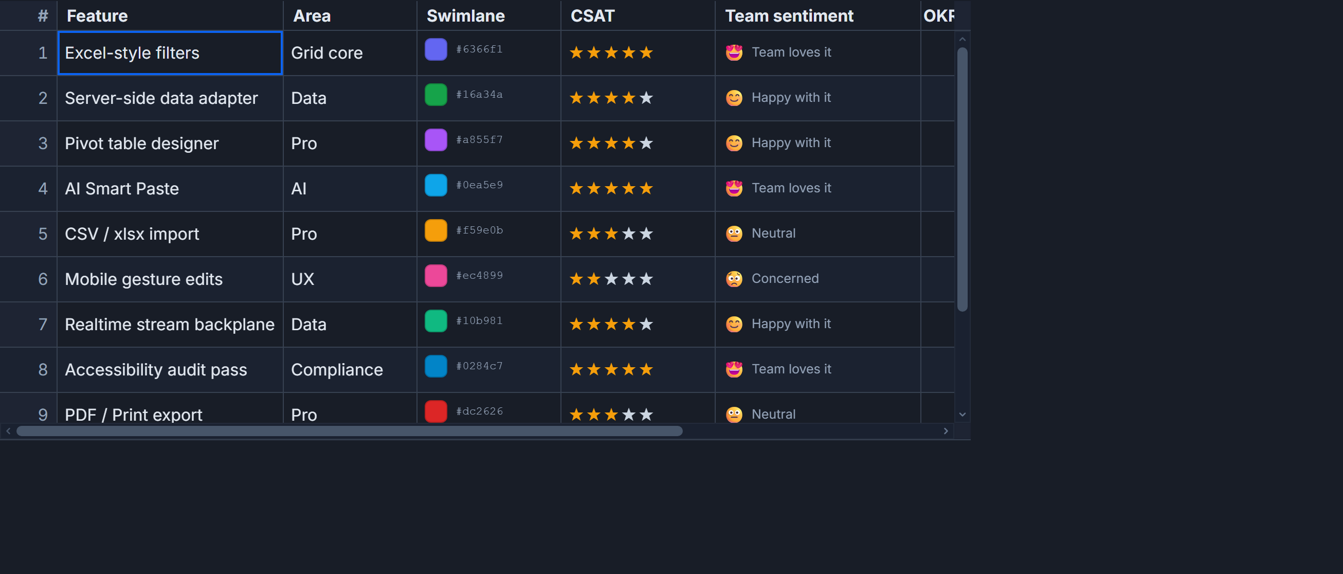 Custom cell editors, including dropdowns, in SvGrid.
The simplest version - always-editable inline select
When the column should always show a dropdown (not a display value with an edit toggle), render the <select> directly in the cell snippet and commit on change:
<script lang="ts">
  import SvGrid from '@svgrid/grid'
  import { renderSnippet, type ColumnDef } from '@svgrid/grid'

  type Row = { id: number; name: string; status: string }

  const STATUSES = ['Active', 'Pending', 'Closed', 'Archived']

  let rows = $state<Row[]>([
    { id: 1, name: 'Alpha project', status: 'Active' },
    { id: 2, name: 'Beta rollout', status: 'Pending' },
    { id: 3, name: 'Legacy cleanup', status: 'Closed' },
  ])

  function commitStatus(row: Row, next: string) {
    const idx = rows.findIndex((r) => r.id === row.id)
    if (idx !== -1) rows[idx] = { ...rows[idx], status: next }
  }
</script>

{#snippet statusCell({ row })}
  <select
    value={row.original.status}
    onchange={(e) => commitStatus(row.original, (e.currentTarget as HTMLSelectElement).value)}
  >
    {#each STATUSES as s}
      <option value={s}>{s}</option>
    {/each}
  </select>
{/snippet}

{@const columns: ColumnDef<any, Row>[] = [
  { id: 'name', field: 'name', header: 'Name', width: 240 },
  {
    id: 'status',
    field: 'status',
    header: 'Status',
    width: 140,
    cell: statusCell,
  },
]}

<SvGrid data={rows} {columns} sortable filterable />
row.original is the raw data record - the same reference you passed into data. Spreading into a new object and replacing rows[idx] keeps Svelte's reactivity clean. Mutating properties in-place works too with $state, but the spread pattern makes undo logic easier to layer in later.
Display mode + edit mode - the two-state approach
An always-visible <select> works but looks busy. Most UIs render a badge or plain text by default and only reveal the dropdown when the user clicks the cell. Wire that to a local editing state:
<script lang="ts">
  import SvGrid from '@svgrid/grid'
  import { renderSnippet, type ColumnDef, type SvGridApi } from '@svgrid/grid'

  type Row = { id: number; name: string; priority: string }

  const PRIORITIES = ['Critical', 'High', 'Medium', 'Low']
  const PRIORITY_COLOR: Record<string, string> = {
    Critical: '#dc2626',
    High: '#ea580c',
    Medium: '#ca8a04',
    Low: '#16a34a',
  }

  let rows = $state<Row[]>([
    { id: 1, name: 'Fix login bug', priority: 'Critical' },
    { id: 2, name: 'Add dark mode', priority: 'Medium' },
    { id: 3, name: 'Update readme', priority: 'Low' },
  ])

  let editingCell = $state<number | null>(null)

  function commitPriority(row: Row, next: string) {
    const idx = rows.findIndex((r) => r.id === row.id)
    if (idx !== -1) rows[idx] = { ...rows[idx], priority: next }
    editingCell = null
  }
</script>

{#snippet priorityCell({ row })}
  {#if editingCell === row.original.id}
    <select
      value={row.original.priority}
      onchange={(e) => commitPriority(row.original, (e.currentTarget as HTMLSelectElement).value)}
      onblur={() => (editingCell = null)}
    >
      {#each PRIORITIES as p}
        <option value={p}>{p}</option>
      {/each}
    </select>
  {:else}
    <button
      class="priority-badge"
      style="color: {PRIORITY_COLOR[row.original.priority]}"
      onclick={() => (editingCell = row.original.id)}
    >
      {row.original.priority}
    </button>
  {/if}
{/snippet}

{@const columns: ColumnDef<any, Row>[] = [
  { id: 'name', field: 'name', header: 'Task', width: 260 },
  {
    id: 'priority',
    field: 'priority',
    header: 'Priority',
    width: 120,
    cell: priorityCell,
  },
]}

<SvGrid data={rows} {columns} sortable filterable />

<style>
  .priority-badge {
    background: none;
    border: none;
    cursor: pointer;
    font-weight: 600;
    padding: 2px 6px;
    border-radius: 4px;
  }
  .priority-badge:hover {
    background: var(--sg-border);
  }
</style>
The onblur handler on the <select> collapses back to badge mode if the user clicks away without choosing. This prevents the cell from staying in edit mode indefinitely.
Loading options from the server
Static arrays work for small enumerations. When options are user-managed - think assignees pulled from a team API - fetch once at component mount and share the list across all cells:
<script lang="ts">
  import SvGrid from '@svgrid/grid'
  import { type ColumnDef } from '@svgrid/grid'
  import { onMount } from 'svelte'

  type Row = { id: number; title: string; assigneeId: number | null }
  type User = { id: number; name: string }

  let rows = $state<Row[]>([
    { id: 1, title: 'Design review', assigneeId: null },
    { id: 2, title: 'Code audit', assigneeId: 42 },
  ])

  let users = $state<User[]>([])
  let usersLoaded = $state(false)

  onMount(async () => {
    const res = await fetch('/api/users')
    users = await res.json()
    usersLoaded = true
  })

  function commitAssignee(row: Row, rawValue: string) {
    const next = rawValue === '' ? null : Number(rawValue)
    const idx = rows.findIndex((r) => r.id === row.id)
    if (idx !== -1) rows[idx] = { ...rows[idx], assigneeId: next }
  }
</script>

{#snippet assigneeCell({ row })}
  {#if !usersLoaded}
    <span class="loading">Loading...</span>
  {:else}
    <select
      value={row.original.assigneeId ?? ''}
      onchange={(e) => commitAssignee(row.original, (e.currentTarget as HTMLSelectElement).value)}
    >
      <option value="">Unassigned</option>
      {#each users as u}
        <option value={u.id}>{u.name}</option>
      {/each}
    </select>
  {/if}
{/snippet}

{@const columns: ColumnDef<any, Row>[] = [
  { id: 'title', field: 'title', header: 'Task', width: 260 },
  {
    id: 'assigneeId',
    field: 'assigneeId',
    header: 'Assignee',
    width: 180,
    cell: assigneeCell,
  },
]}

<SvGrid data={rows} {columns} sortable filterable />
One thing to watch: do not fetch inside the snippet itself. Each cell re-renders independently on scroll virtualization, so a per-cell fetch would fire constantly. Fetch once, store in component-level $state, and all cells read from the same array.
Sorting and filtering still work on the raw value
Because the cell snippet only controls rendering, the underlying field value is still a plain string or number. SvGrid sorts and filters on field, not on what the cell displays. That means you get sorting alphabetically on "Active/Pending/Closed" and filtering with a text filter row without any additional configuration. If you want to control sort order (Critical before High before Medium), use a sortingFn on the column definition - but for most cases the default behavior is correct.
Accessibility out of the box
A native <select> is keyboard-navigable and screen-reader-announced without any extra work. Arrow keys cycle options, Enter commits, Escape closes. If you replace it with a custom combobox component (for styling control or search-within-options), the component needs to implement the ARIA combobox or listbox pattern yourself - the browser does not do that for free.
The native element is the right default for most grids. Reach for a custom combobox only when you need type-to-search across a long option list - for example, selecting from hundreds of users. For a list of five statuses, a native <select> beats a custom widget on every axis: smaller bundle, better accessibility, less code to maintain.