A Date-Picker Cell Editor in SvGrid
How to make date columns editable with a real date picker in SvGrid - including display formatting, time zone handling, and validation that preserves user input.
Dates are the most deceptively simple data type in any grid. The column looks like a string, sorts like a string if you're not careful, and the moment someone edits a value through a text field you've introduced three new bugs - invalid formats, off-by-one days from time zone math, and end dates that slip before start dates. The good news: SvGrid's editorType: 'date' sidesteps most of this by default. The care goes into formatting and a few deliberate choices about time zones.
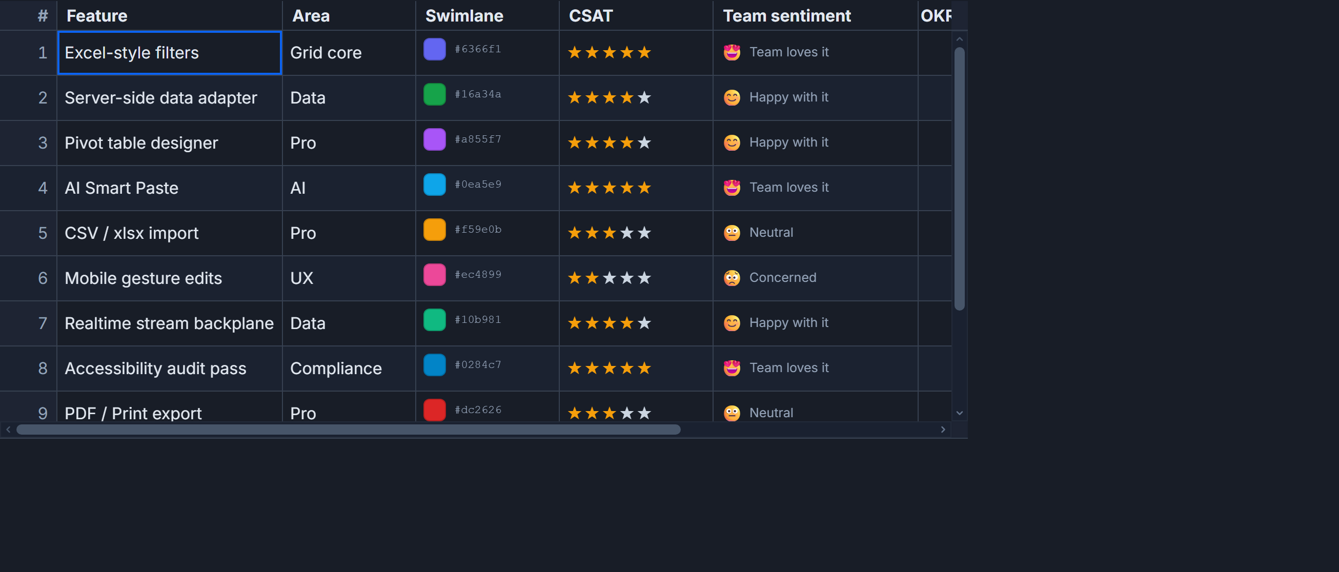 A date column with a native picker on edit and a localized display string at rest.
One property to activate the picker
The minimum viable date column looks like this:
import SvGrid from '@svgrid/grid'
import type { ColumnDef } from '@svgrid/grid'

interface Project {
  id: number
  name: string
  startedAt: string   // ISO 8601, e.g. "2025-03-14"
  deadline: string
}

const columns: ColumnDef<{}, Project>[] = [
  {
    id: 'name',
    field: 'name',
    header: 'Project',
    width: 220,
  },
  {
    id: 'startedAt',
    field: 'startedAt',
    header: 'Started',
    width: 140,
    editorType: 'date',
    format: { type: 'date', pattern: 'MMM d, yyyy' },
  },
  {
    id: 'deadline',
    field: 'deadline',
    header: 'Deadline',
    width: 140,
    editorType: 'date',
    format: { type: 'date', pattern: 'MMM d, yyyy' },
  },
]
editorType: 'date' gives the user a native date picker when they click into the cell. The format option controls how the value is displayed while the cell is at rest. Critically, the underlying value stays as ISO - so sorting and filtering work on the real date, not on "Mar 14, 2025" treated alphabetically.
For columns that need both date and time, swap in editorType: 'datetime'. The picker expands to include a time selector and the format pattern should reflect that:
{
  id: 'scheduledAt',
  field: 'scheduledAt',
  header: 'Scheduled',
  width: 180,
  editorType: 'datetime',
  format: { type: 'date', pattern: 'MMM d, yyyy HH:mm' },
}
Keep ISO in your data, format on the column
The most common date sorting bug in any grid has the same root cause: display strings mixed into the data layer. Once you store "March 14" instead of "2025-03-14", the column can only sort lexicographically and you have to keep formatting logic in sync everywhere that data is read.
The pattern that avoids this entirely: your row data holds ISO strings (or Date objects), and format on the column handles all presentation. The grid sorts and filters on the raw value. You format once, in one place.
If you're pulling data from an API that returns Unix timestamps, convert on the way in:
const rows: Project[] = rawApiRows.map((r) => ({
  ...r,
  startedAt: new Date(r.startedAt * 1000).toISOString().slice(0, 10),
  deadline: new Date(r.deadline * 1000).toISOString().slice(0, 10),
}))
Then the column definition stays simple and never needs to know about timestamps.
The time zone decision you have to make once
The classic off-by-one-day problem comes from not making a deliberate choice. Your options:
- Display in the user's local time zone - natural for consumer apps, but the same instant is "March 14" for someone in New York and "March 15" for someone in Tokyo.
- Display in UTC consistently - predictable across all users and servers, slightly less intuitive for events tied to local time.
There is no universally correct answer, but you must pick one and apply it everywhere. The symptom of not picking is dates that shift by a day depending on who is looking at them.
For date-only fields (no time component), the safest storage format is plain YYYY-MM-DD - no T00:00:00Z suffix. A full ISO instant at midnight UTC becomes "the previous day" in any time zone west of Greenwich. A bare date string has no time zone ambiguity at all.
Validating the edited value
A date picker prevents invalid formats, but it does not prevent logical errors - a deadline set before the start date, or a date outside an allowed range. Catch these in onCellValueChange:
<script lang="ts">
  import SvGrid from '@svgrid/grid'
  import type { SvGridOptions } from '@svgrid/grid'

  let data = $state(rows)

  const options: SvGridOptions = {
    onCellValueChange: ({ field, value, row, rejectChange }) => {
      if (field === 'deadline') {
        const start = new Date(row.startedAt)
        const end = new Date(value as string)

        if (end < start) {
          // rejectChange keeps the editor open with the user's input intact
          rejectChange('Deadline cannot be before start date')
          return
        }
      }

      if (field === 'startedAt') {
        const minDate = new Date('2020-01-01')
        const picked = new Date(value as string)

        if (picked < minDate) {
          rejectChange('Start date must be 2020 or later')
          return
        }
      }
    },
  }
</script>

<SvGrid {data} {columns} editable {options} />
The rejectChange callback is the important part here. It keeps the editor open and the user's input visible so they can correct it rather than losing what they typed. A grid that silently reverts the cell on a validation error is frustrating to use.
Wiring it together with the full component
A complete implementation with sorting, inline editing, and cross-column validation:
<script lang="ts">
  import SvGrid from '@svgrid/grid'
  import type { ColumnDef, SvGridOptions } from '@svgrid/grid'

  interface Project {
    id: number
    name: string
    startedAt: string
    deadline: string
  }

  let data: Project[] = $state([
    { id: 1, name: 'Alpha', startedAt: '2025-01-10', deadline: '2025-06-30' },
    { id: 2, name: 'Beta',  startedAt: '2025-03-01', deadline: '2025-12-15' },
    { id: 3, name: 'Gamma', startedAt: '2025-07-01', deadline: '2026-03-01' },
  ])

  const columns: ColumnDef<{}, Project>[] = [
    { id: 'name',      field: 'name',      header: 'Project',  width: 200 },
    { id: 'startedAt', field: 'startedAt', header: 'Started',  width: 150,
      editorType: 'date', format: { type: 'date', pattern: 'MMM d, yyyy' } },
    { id: 'deadline',  field: 'deadline',  header: 'Deadline', width: 150,
      editorType: 'date', format: { type: 'date', pattern: 'MMM d, yyyy' } },
  ]

  const options: SvGridOptions = {
    onCellValueChange: ({ field, value, row, rejectChange }) => {
      if (field === 'deadline' && new Date(value as string) < new Date(row.startedAt)) {
        rejectChange('Deadline must be after the start date')
      }
    },
  }
</script>

<SvGrid {data} {columns} sortable editable {options} />
When to reach for a custom editor
The built-in date picker covers most cases. The times you would write a custom editor instead:
- You need a third-party date picker with a different UI (month/year pickers, calendar popovers with range selection).
- You need to constrain available dates per row - a booking grid where some dates are already taken, for instance.
- You're working with calendar systems other than Gregorian.
For a custom editor, implement a Svelte component that accepts value and dispatches change with the new ISO string. The column definition takes a editor component reference instead of editorType. The validation pattern in onCellValueChange stays exactly the same regardless of which editor you use.
For most business grids - project timelines, order dates, appointment columns - the built-in editor is the right call. It handles keyboard navigation, accessibility, and mobile correctly out of the box, and keeping the display format separate from the stored value means you never have to migrate data when design wants a different date format.