Cell Tooltips Done Right in a Data Grid
Tooltips in a data grid are either cheap and effective or an accessibility and performance trap. Here is how to build them correctly in SvGrid.
Most grids ship with no tooltip support at all. You have to roll your own, and the obvious approaches have real problems: one tooltip element per cell (thrashes the DOM), mouse-only triggers (breaks keyboard nav), or tooltip content computed inside the cell render (fires on every virtualization cycle). None of these are acceptable in production.
The good news is that a grid with proper virtualization actually makes tooltip performance easier, not harder. SvGrid keeps around 30-50 cells in the DOM at any given time. If you build a single shared tooltip positioned on hover, the overhead is negligible.
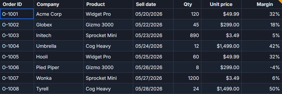 Cell tooltips and notes in SvGrid.
When the native title attribute is actually the right answer
Before reaching for a custom component, consider what you actually need. If the tooltip just shows the full value of a truncated string, the title attribute on a custom cell snippet is genuinely the right tool:
<!-- In your .svelte file -->
<script>
  import SvGrid from '@svgrid/grid'
  import type { ColumnDef } from '@svgrid/grid'

  const columns: ColumnDef[] = [
    {
      id: 'name',
      field: 'name',
      header: 'Name',
      width: 180,
      cell: nameCell,
    },
    {
      id: 'description',
      field: 'description',
      header: 'Description',
      width: 220,
      cell: descCell,
    },
  ]
</script>

{#snippet nameCell({ value }: { value: string })}
  <span class="sg-truncate" title={value}>{value}</span>
{/snippet}

{#snippet descCell({ value }: { value: string })}
  <span class="sg-truncate" title={value}>{value}</span>
{/snippet}

<SvGrid {data} {columns} />

<style>
  .sg-truncate {
    display: block;
    overflow: hidden;
    text-overflow: ellipsis;
    white-space: nowrap;
  }
</style>
title is keyboard-accessible in modern browsers (shows on focus), announced by screen readers, and requires zero JavaScript. The downside is you cannot style it. If that is acceptable, stop here.
A shared tooltip for rich content
The moment you need formatted content, status explanations, or multiple fields in a single tooltip, you need a custom element. The pattern that works: one tooltip node in the document, moved and populated on hover. Not one per cell.
<script>
  import SvGrid from '@svgrid/grid'
  import type { ColumnDef } from '@svgrid/grid'

  type Row = {
    id: number
    status: string
    statusLabel: string
    statusDetail: string
    score: number
  }

  let tooltip = $state<{ visible: boolean; x: number; y: number; content: string }>({
    visible: false,
    x: 0,
    y: 0,
    content: '',
  })

  function showTooltip(e: MouseEvent | FocusEvent, text: string) {
    const rect = (e.currentTarget as HTMLElement).getBoundingClientRect()
    tooltip = {
      visible: true,
      x: rect.left + window.scrollX,
      y: rect.bottom + window.scrollY + 4,
      content: text,
    }
  }

  function hideTooltip() {
    tooltip.visible = false
  }

  const columns: ColumnDef<Row>[] = [
    { id: 'id', field: 'id', header: 'ID', width: 60 },
    {
      id: 'status',
      field: 'status',
      header: 'Status',
      width: 120,
      cell: statusCell,
    },
    {
      id: 'score',
      field: 'score',
      header: 'Score',
      width: 100,
      cell: scoreCell,
    },
  ]
</script>

{#snippet statusCell({ value, row }: { value: string; row: Row })}
  <span
    class="status-badge status-{value}"
    onmouseenter={(e) => showTooltip(e, row.statusDetail)}
    onmouseleave={hideTooltip}
    onfocus={(e) => showTooltip(e, row.statusDetail)}
    onblur={hideTooltip}
    tabindex="0"
    role="button"
    aria-describedby="sg-tooltip"
  >
    {row.statusLabel}
  </span>
{/snippet}

{#snippet scoreCell({ value }: { value: number })}
  {@const label = value >= 90 ? 'Excellent - top 10%' : value >= 70 ? 'Good - above average' : 'Needs attention'}
  <span
    onmouseenter={(e) => showTooltip(e, label)}
    onmouseleave={hideTooltip}
    onfocus={(e) => showTooltip(e, label)}
    onblur={hideTooltip}
    tabindex="0"
    aria-describedby="sg-tooltip"
  >
    {value}
  </span>
{/snippet}

<SvGrid {data} {columns} />

{#if tooltip.visible}
  <div
    id="sg-tooltip"
    role="tooltip"
    class="sg-tooltip"
    style="left: {tooltip.x}px; top: {tooltip.y}px"
  >
    {tooltip.content}
  </div>
{/if}

<style>
  .sg-tooltip {
    position: absolute;
    z-index: 1000;
    background: #1e1e2e;
    color: #cdd6f4;
    border: 1px solid #45475a;
    border-radius: 6px;
    padding: 6px 10px;
    font-size: 12px;
    max-width: 260px;
    pointer-events: none;
    box-shadow: 0 4px 12px rgba(0, 0, 0, 0.3);
  }
</style>
The aria-describedby="sg-tooltip" link is what makes this accessible. Screen readers read the tooltip content when the cell is focused. The role="tooltip" on the element confirms its semantic role. Without both of these, you have a tooltip for sighted mouse users only.
Keyboard dismissal
A tooltip that appears on focus should disappear when the user presses Escape - this is the expected browser behavior. Add a document-level keydown listener while any tooltip is showing:
<script>
  // Add inside the component that owns tooltip state
  import { onMount } from 'svelte'

  onMount(() => {
    function onKeyDown(e: KeyboardEvent) {
      if (e.key === 'Escape' && tooltip.visible) {
        tooltip.visible = false
      }
    }
    document.addEventListener('keydown', onKeyDown)
    return () => document.removeEventListener('keydown', onKeyDown)
  })
</script>
This is one of those small details that separates a polished grid from a functional one. It also matches what ARIA authoring practices require for tooltip widgets.
Positioning edge cases
The naive rect.left + rect.bottom approach works until a tooltip runs off the right edge or below the viewport fold. A production-grade version needs to check available space:
<script>
  function showTooltip(e: MouseEvent | FocusEvent, text: string) {
    const el = e.currentTarget as HTMLElement
    const rect = el.getBoundingClientRect()
    const TOOLTIP_WIDTH = 260
    const TOOLTIP_OFFSET = 4

    let x = rect.left + window.scrollX
    let y = rect.bottom + window.scrollY + TOOLTIP_OFFSET

    // Clamp to right edge
    const rightOverflow = x + TOOLTIP_WIDTH - (window.scrollX + window.innerWidth)
    if (rightOverflow > 0) {
      x -= rightOverflow + 8
    }

    // Flip above if too close to the bottom
    const spaceBelow = window.innerHeight - rect.bottom
    if (spaceBelow < 80) {
      y = rect.top + window.scrollY - TOOLTIP_OFFSET - 40
    }

    tooltip = { visible: true, x, y, content: text }
  }
</script>
The magic numbers (80, 40) are approximate tooltip height guards. If you know your tooltip height precisely, use it. Otherwise these thresholds work for single-line content.
What does not work
A few patterns I would avoid:
One tooltip element per cell. With 10 columns and 30 visible rows, that is 300 DOM nodes carrying event listeners and state that are destroyed and recreated constantly by the virtualizer. The shared tooltip approach costs nearly zero by comparison.
Computing tooltip content in the cell render function itself. If the content derivation is expensive (a lookup, a format, a calculation), doing it in the snippet body means it runs on every render cycle. Compute it lazily inside showTooltip instead, where it only runs when the user actually triggers the tooltip.
CSS-only hover tooltips with ::after pseudo-elements. These cannot be made keyboard-accessible without JavaScript, they cannot contain structured HTML, and positioning them correctly across a pinned-column grid is a genuine headache. The JavaScript approach is less clever but substantially more correct.
Composing it into a reusable snippet
If you have many columns that need the same tooltip treatment, extract a higher-order helper rather than duplicating the event handler wiring:
<!-- Wrap any cell content with tooltip behavior -->
{#snippet withTooltip({ children, content }: { children: Snippet; content: string })}
  <span
    onmouseenter={(e) => showTooltip(e, content)}
    onmouseleave={hideTooltip}
    onfocus={(e) => showTooltip(e, content)}
    onblur={hideTooltip}
    tabindex="0"
    aria-describedby="sg-tooltip"
  >
    {@render children()}
  </span>
{/snippet}
Svelte 5 snippets compose cleanly this way. You get one place to update the accessibility wiring if requirements change, and column definitions stay readable.
Tooltips are one of those features where "close enough" ships quickly but the last 20% - keyboard access, dismissal, viewport clamping, screen reader announcement - takes time and is easy to skip under deadline pressure. The patterns above cover the full surface. Use title when you can, reach for the shared tooltip pattern when you cannot, and wire aria-describedby every time.