Inside SvGrid: A Theming System on CSS Variables
How SvGrid uses --sg-* CSS custom properties to make theming a CSS problem, not a JavaScript one - and why that keeps dark mode, design system adoption, and per-grid overrides simple.
Every data grid eventually faces the same moment: someone drops it into their product and the colors are wrong. The header is the wrong shade. The border doesn't match. The font-size is off. How you respond to that moment reveals a lot about your architectural assumptions.
SvGrid's answer is that theming is a CSS problem and should stay one.
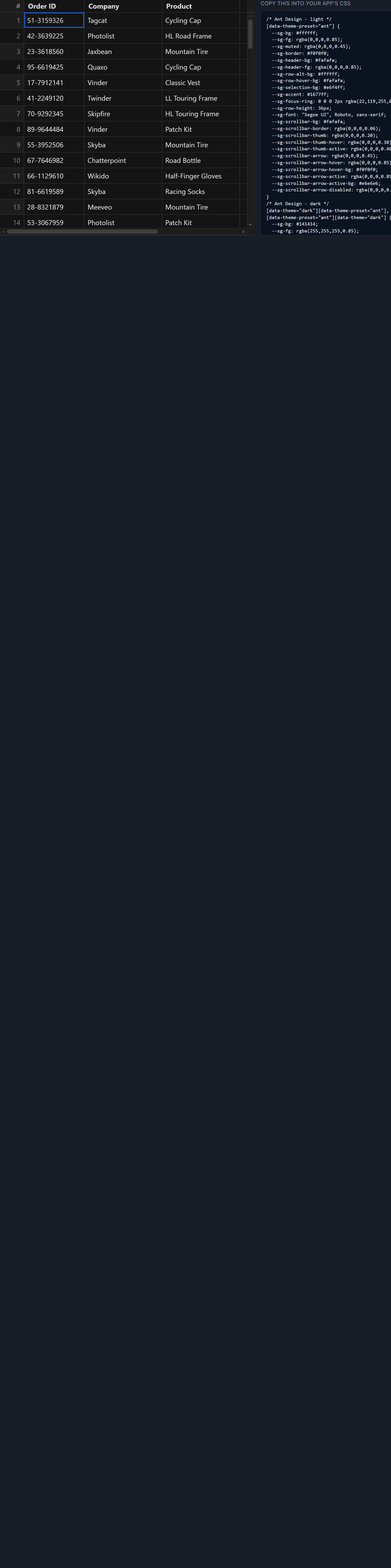 SvGrid themed to match a design system.
Why not a JavaScript theme config
There's a popular pattern in component libraries where you pass a theme object - some nested configuration of colors and spacing - into the component or a provider. It seems ergonomic until you're six months in and the object has grown to 200 keys, someone needs to override a hover state in a specific column, and you're reading docs trying to find a property called headerHoveredBorderColor.
We didn't do that.
Every visual surface in SvGrid reads from a CSS custom property with the --sg- prefix. To restyle the grid, you write CSS:
.my-grid {
  --sg-bg: #ffffff;
  --sg-fg: #1f2933;
  --sg-border: #e4e7eb;
  --sg-header-bg: #f5f7fa;
  --sg-header-fg: #2d3748;
  --sg-row-alt-bg: #fafbfc;
  --sg-accent: #3b82f6;
  --sg-radius: 4px;
  --sg-cell-px: 12px;
  --sg-thead-h: 40px;
}
That's the entire API surface for appearance. No imports, no rebuild, no layer of abstraction between you and the browser's own cascading rules.
The reasoning was straightforward: developers already know CSS. A custom property cascades, can be scoped to a selector, overridden in a media query, and pointed at any existing token. You don't need to learn our theming language to do any of that. You already know how to do it.
Dark mode as a consequence, not a feature
The useful side effect of putting every color behind a token is that dark mode becomes trivial. You define two sets of values, keyed off a class or attribute, and flip the switch:
:root[data-theme='light'] {
  --sg-bg: #ffffff;
  --sg-fg: #111827;
  --sg-border: #e5e7eb;
  --sg-header-bg: #f9fafb;
  --sg-row-alt-bg: #f3f4f6;
  --sg-accent: #3b82f6;
}

:root[data-theme='dark'] {
  --sg-bg: #0f172a;
  --sg-fg: #e2e8f0;
  --sg-border: #1e293b;
  --sg-header-bg: #1e293b;
  --sg-row-alt-bg: #0d1526;
  --sg-accent: #60a5fa;
}
The grid doesn't re-render. There's no flash. No state update triggers a component tree reconciliation. The browser just sees the custom properties change and repaints. The performance profile is as close to zero as you can get.
We didn't set out to make dark mode easy - we set out to avoid a JavaScript theme config. Dark mode support fell out of that as a consequence. That's usually a sign a decision was architecturally sound.
Adopting a design system
The real test is whether SvGrid can disappear into someone else's product and match their brand without friction. Because the tokens are just CSS variables, the mapping is one line per token:
/* pointing SvGrid tokens at an existing design system */
.my-grid {
  --sg-bg: var(--color-surface);
  --sg-fg: var(--color-text-primary);
  --sg-border: var(--color-border-subtle);
  --sg-header-bg: var(--color-surface-raised);
  --sg-accent: var(--color-brand-500);
  --sg-radius: var(--radius-sm);
  --sg-cell-px: var(--spacing-3);
}
If you have a design token system, you point SvGrid at it. If your brand color changes in the token system, the grid updates for free without touching grid-specific code. That's the difference between a grid that looks like ours and one that looks like yours.
Scoping overrides to a single grid
One thing a JavaScript theme config handles poorly is the case where you have two grids on the same page with different visual treatments. With CSS variables, that's just a selector:
<script>
  import SvGrid from '@svgrid/grid'
  import type { ColumnDef } from '@svgrid/grid'

  const cols: ColumnDef<any, any>[] = [
    { id: 'name', field: 'name', header: 'Name', width: 200 },
    { id: 'value', field: 'value', header: 'Value', width: 120, type: 'number' },
  ]
</script>

<div class="compact-grid">
  <SvGrid data={summaryRows} columns={cols} rowHeight={24} />
</div>

<div class="detail-grid">
  <SvGrid data={detailRows} columns={cols} rowHeight={36} />
</div>

<style>
  .compact-grid {
    --sg-cell-px: 8px;
    --sg-thead-h: 28px;
    --sg-border: #d1d5db;
    font-size: 12px;
  }

  .detail-grid {
    --sg-cell-px: 16px;
    --sg-thead-h: 44px;
    --sg-header-bg: #f0fdf4;
    --sg-accent: #16a34a;
  }
</style>
Two grids, two visual treatments, zero JavaScript configuration. The cascade handles the scoping.
What a runtime theming API would have cost
There's a counter-argument that a JavaScript API is better for dynamic themes - where values change at runtime based on user input or application state. But CSS variables already update at runtime, and because they're read directly by the browser's rendering engine, an assignment to document.documentElement.style.setProperty('--sg-accent', newColor) takes effect in the next paint with no intermediary.
If you need to theme the grid from JavaScript, the path is still CSS:
// theme switching from TS - no SvGrid API needed
function setTheme(accent: string, isDark: boolean) {
  const root = document.documentElement
  root.setAttribute('data-theme', isDark ? 'dark' : 'light')
  root.style.setProperty('--sg-accent', accent)
}
Adding a parallel JavaScript theming API would have meant maintaining two separate surfaces, with documented behavior, for doing the same thing. The platform already has a theming API and it's called CSS. We chose not to compete with it.
The token surface
The full set of --sg-* tokens covers backgrounds, foregrounds, borders, accent colors, geometry (padding, row heights, border radius), and header appearance. Adding your own overrides is a one-time addition to a stylesheet.
For teams integrating a Tailwind-based design system, the tokens map cleanly to Tailwind's CSS variable output when configured with hsl values. For teams on a different token system, the mapping is the same exercise either way - find our token, point it at yours.
The theming documentation at Theming and Dark Mode covers the full token reference and a few patterns for structured theme switching. The underlying point is that there's nothing SvGrid-specific to learn about how CSS variables cascade - so any CSS knowledge you already have applies directly.
Where this leaves the grid is in a good position: it can match your product's appearance without asking you to give up your existing design system or learn a new configuration format. That was the goal.