Building an Admin Dashboard in Svelte 5
A practical walkthrough for wiring SvGrid into an admin layout - correct sizing, reactive bulk actions, inline edits with optimistic saves, and a clean handoff to server-side data.
Most admin dashboards are secretly just a data grid with a toolbar above it and a sidebar beside it. The moment you accept that, the architecture becomes obvious: get the grid sized correctly, wire selection to your action bar, and handle edits cleanly. Everything else is styling.
Here is how I build them with SvGrid in Svelte 5.
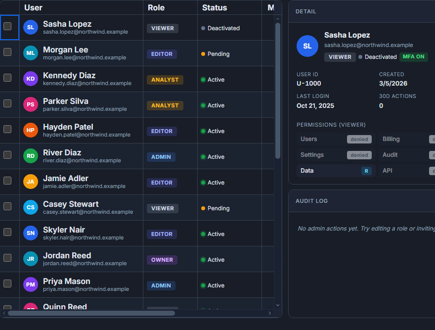 An admin dashboard built around SvGrid.
Getting the layout right before anything else
The single most common mistake I see is letting the grid grow to match its content instead of filling its container. Once you do that, the browser has to scroll the page rather than the grid, and virtualization stops working because the grid thinks all rows are visible.
The fix is a flex column where the grid's wrapper gets flex: 1 and min-height: 0. The min-height: 0 is what actually matters - without it, a flex child ignores its container's height constraint and expands freely.
<div style="display:flex; flex-direction:column; height:100vh;">
  <header style="height:56px; flex-shrink:0;">App bar</header>
  <div style="display:flex; flex:1; min-height:0;">
    <aside style="width:220px; flex-shrink:0;">Nav</aside>
    <main style="flex:1; min-height:0; display:flex; flex-direction:column;">
      <Toolbar />
      <!-- this wrapper is what the grid fills -->
      <div style="flex:1; min-height:0; overflow:hidden;">
        <SvGrid
          data={rows}
          {columns}
          {features}
          sortable
          filterable
          pageable
          rowHeight={36}
          virtualization={true}
          onApiReady={(a) => (api = a)}
        />
      </div>
    </main>
  </div>
</div>
With this in place, the grid scrolls internally at any data size and virtualization renders only the visible rows.
Picking the right features up front
SvGrid is tree-shakeable at the feature level, so only register what your dashboard actually needs. For a typical admin table that is sorting, filtering, pagination, and row selection:
import {
  tableFeatures,
  rowSortingFeature,
  columnFilteringFeature,
  rowPaginationFeature,
  rowSelectionFeature,
} from '@svgrid/grid'

const features = tableFeatures({
  rowSortingFeature,
  columnFilteringFeature,
  rowPaginationFeature,
  rowSelectionFeature,
})
If you are also doing inline editing you do not need an extra feature - it is controlled through column-level editable: true and the onCellEditEnd callback. Add rowExpandingFeature only if you need expandable rows for detail panels.
For columns I usually pin identifiers on the left and action buttons on the right, so they stay visible when the user scrolls horizontally on narrow screens:
import type { ColumnDef } from '@svgrid/grid'

const columns: ColumnDef<typeof features, User>[] = [
  { id: 'name', field: 'name', header: 'Name', width: 180, pinned: 'left' },
  { id: 'email', field: 'email', header: 'Email', width: 220 },
  { id: 'role', field: 'role', header: 'Role', width: 120, editable: true },
  { id: 'status', field: 'status', header: 'Status', width: 100, cell: statusCell },
  { id: 'created', field: 'createdAt', header: 'Joined', width: 130, type: 'date' },
  { id: 'actions', header: '', width: 72, pinned: 'right', cell: actionsCell },
]
A selection-driven action bar
The admin pattern users expect: check rows, see a contextual bar appear with relevant actions. This is where Svelte 5 reactivity shines - the bar is just a reactive snippet watching a piece of state.
<script lang="ts">
  import SvGrid, { type SvGridApi } from '@svgrid/grid'

  let api: SvGridApi | undefined = $state()
  let selectedRows: User[] = $state([])

  function handleSelectionChange(_state: unknown, rows: User[]) {
    selectedRows = rows
  }

  async function archiveSelected() {
    const ids = selectedRows.map((r) => r.id)
    await fetch('/api/users/archive', {
      method: 'POST',
      body: JSON.stringify({ ids }),
      headers: { 'Content-Type': 'application/json' },
    })
    api?.applyTransaction({ remove: selectedRows })
    api?.clearRowSelection()
  }

  function exportSelected() {
    api?.exportToCsv({ rows: 'selected', filename: 'users-export.csv' })
  }
</script>

{#if selectedRows.length > 0}
  <div class="bulk-bar">
    <span>{selectedRows.length} selected</span>
    <button onclick={archiveSelected}>Archive</button>
    <button onclick={exportSelected}>Export CSV</button>
    <button onclick={() => api?.clearRowSelection()}>Clear</button>
  </div>
{/if}

<SvGrid
  data={rows}
  {columns}
  {features}
  onRowSelectionChange={handleSelectionChange}
  sortable
  filterable
  pageable
  showFilterRow={true}
  onApiReady={(a) => (api = a)}
/>
applyTransaction is the right call here rather than mutating rows directly - it tells the grid exactly what changed without a full re-render.
Inline editing with optimistic saves
Editable columns are the easiest part. Set editable: true on the column, then handle onCellEditEnd. The optimistic pattern - apply locally first, roll back on failure - keeps the UI feeling fast even on slow connections:
async function handleCellEdit(event: CellEditEvent<User>) {
  const { rowIndex, row, columnId, newValue, oldValue } = event

  // apply locally right away
  rows[rowIndex] = { ...row, [columnId]: newValue }

  try {
    await fetch(`/api/users/${row.id}`, {
      method: 'PATCH',
      body: JSON.stringify({ [columnId]: newValue }),
      headers: { 'Content-Type': 'application/json' },
    })
  } catch {
    // roll back if the server rejected it
    rows[rowIndex] = { ...row, [columnId]: oldValue }
  }
}
If you need undo support without managing it yourself, api.undo() and api.redo() are available once you enable the edit history - useful for power users who make a lot of rapid changes.
Switching to server-side data
Local data works fine up to a few thousand rows. Beyond that, or when you need server-enforced filters for security reasons, swap the data prop for a createServerDataSource and nothing else changes in the template:
import { createServerDataSource } from '@svgrid/grid'

const ds = createServerDataSource({
  fetch: async ({ page, pageSize, sort, filters }) => {
    const params = new URLSearchParams({
      page: String(page),
      size: String(pageSize),
    })
    if (sort.length) {
      params.set('sort', sort[0].id)
      params.set('dir', sort[0].desc ? 'desc' : 'asc')
    }
    filters.forEach((f) => {
      params.set(`filter[${f.id}]`, String(f.value))
    })
    const res = await fetch(`/api/users?${params}`)
    const json = await res.json()
    return { rows: json.data, total: json.total }
  },
})

// then just:
// <SvGrid data={ds} {columns} {features} pageable />
The grid passes the current page, page size, sort state, and active filters into the fetch function each time any of them change. You handle the API shape; the grid handles re-fetching and loading state.
One tradeoff worth calling out
With server-side data, api.getSelectedRows() returns only the rows on the current page. If your admin workflow needs cross-page selection - for example, "select all 4,000 users matching this filter and archive them" - you need to track selection IDs separately and send those IDs to the server rather than relying on the client's selected row objects. I usually store a Set<string> of selected IDs alongside the grid's selection state for this case.
For most dashboards, per-page selection is fine. Just know the boundary before you promise cross-page bulk actions to a product manager.
The full picture for a production admin screen is not much more than what is shown here. Layout gets the grid filling its space correctly, features cover the standard interactions, the action bar reacts to selection, and server-side mode handles scale. The rest is your own data shape and business rules.