Avatar and Image Cells in SvGrid
How to render avatars, product thumbnails, and logos in grid cells with proper fallbacks, lazy loading, and accessible alt text using Svelte 5 snippets.
A CRM grid without faces is harder to scan than one with them. People process images faster than names alone, and a 28px avatar next to a contact name cuts the time to find a row roughly in half. The same applies to product grids - a thumbnail column turns a list of SKUs into something a buyer can navigate at a glance.
SvGrid makes this straightforward because cells are just Svelte 5 snippets. You write exactly the markup you want, the grid handles the virtualization, and only visible cells render at any given time. The real craft here is not wiring up the snippet - it is handling the edge cases that bite you in production: missing URLs, broken image requests, and layout shift as images load.
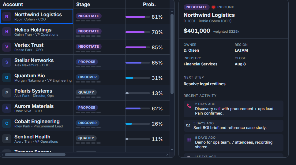 A CRM pipeline grid built with SvGrid.
The column definition
The first thing to get right is the fieldFn. If you point the column at avatarUrl, the grid sorts and filters by URL string, which is useless. Point it at the field you actually want sorting and filtering to use - usually the name:
<script lang="ts">
  import SvGrid from '@svgrid/grid'
  import { renderSnippet, type ColumnDef } from '@svgrid/grid'

  type Contact = {
    id: number
    name: string
    role: string
    avatarUrl: string | null
    company: string
  }

  let data: Contact[] = $state([
    { id: 1, name: 'Anna Kovacs', role: 'Engineer', avatarUrl: '/avatars/anna.jpg', company: 'Acme' },
    { id: 2, name: 'Ben Osei',   role: 'Designer', avatarUrl: null,                  company: 'Globex' },
    { id: 3, name: 'Cleo Tran',  role: 'PM',       avatarUrl: '/avatars/cleo.jpg',   company: 'Acme' },
  ])

  const columns: ColumnDef<Contact>[] = [
    {
      id: 'person',
      header: 'Person',
      fieldFn: (r) => r.name,   // sort/filter by name, not image URL
      width: 220,
      cell: ({ row }) => renderSnippet(AvatarCell, { contact: row.original }),
    },
    { id: 'role',    field: 'role',    header: 'Role',    width: 140 },
    { id: 'company', field: 'company', header: 'Company', width: 160 },
  ]
</script>

{#snippet AvatarCell({ contact }: { contact: Contact })}
  <span class="avatar-cell">
    <img
      src={contact.avatarUrl ?? ''}
      alt={contact.name}
      width="28"
      height="28"
      loading="lazy"
    />
    <span class="avatar-name">{contact.name}</span>
  </span>
{/snippet}

<SvGrid {data} {columns} sortable filterable rowHeight={40} />
That version works when every contact has a valid URL. In practice, they do not.
Handling missing and broken images
Two failure modes need different treatment. A null or empty URL means you know upfront there is nothing to fetch - render initials instead. A broken URL (a 404 the server returns for a deleted image) is only discovered when the browser tries to load it, so you handle it with an onerror handler.
A combined approach covers both:
{#snippet AvatarCell({ contact }: { contact: Contact })}
  {@const initials = contact.name
    .split(' ')
    .filter(Boolean)
    .map((s) => s[0].toUpperCase())
    .slice(0, 2)
    .join('')}

  <span class="avatar-cell">
    {#if contact.avatarUrl}
      <span class="avatar-img-wrapper">
        <img
          src={contact.avatarUrl}
          alt={contact.name}
          width="32"
          height="32"
          loading="lazy"
          onerror={(e) => {
            const el = e.currentTarget as HTMLImageElement
            el.style.display = 'none'
            const fallback = el.nextElementSibling as HTMLElement | null
            if (fallback) fallback.style.display = 'flex'
          }}
        />
        <span class="avatar-initials" style:display="none" aria-hidden="true">
          {initials}
        </span>
      </span>
    {:else}
      <span class="avatar-initials" aria-hidden="true">{initials}</span>
    {/if}
    <span class="avatar-name">{contact.name}</span>
  </span>
{/snippet}

<style>
  .avatar-cell {
    display: flex;
    align-items: center;
    gap: 8px;
  }

  .avatar-img-wrapper {
    position: relative;
    width: 32px;
    height: 32px;
    flex-shrink: 0;
  }

  .avatar-img-wrapper img {
    border-radius: 50%;
    object-fit: cover;
    width: 100%;
    height: 100%;
  }

  .avatar-initials {
    display: flex;
    align-items: center;
    justify-content: center;
    width: 32px;
    height: 32px;
    border-radius: 50%;
    background: var(--sg-accent, #6366f1);
    color: #fff;
    font-size: 11px;
    font-weight: 600;
    flex-shrink: 0;
  }

  .avatar-name {
    overflow: hidden;
    text-overflow: ellipsis;
    white-space: nowrap;
  }
</style>
The onerror path hides the broken image and shows the sibling initials element. Because the grid virtualizes rows, this onerror fires at most once per visible cell, not for thousands of off-screen rows.
Product thumbnails
The same pattern works for product or content grids where you want a thumbnail alongside a title. The main difference is that for decorative thumbnails - where the product name is already in a separate column - alt="" is correct. Announcing the same text twice to a screen reader is noise.
<script lang="ts">
  import SvGrid from '@svgrid/grid'
  import { renderSnippet, type ColumnDef } from '@svgrid/grid'

  type Product = {
    sku: string
    name: string
    thumbnailUrl: string | null
    price: number
    stock: number
  }

  const columns: ColumnDef<Product>[] = [
    {
      id: 'thumb',
      header: '',
      width: 52,
      cell: ({ row }) => renderSnippet(ThumbCell, { product: row.original }),
    },
    { id: 'name',  field: 'name',  header: 'Product', width: 240 },
    { id: 'price', field: 'price', header: 'Price',   width: 100, type: 'number' },
    { id: 'stock', field: 'stock', header: 'Stock',   width: 80,  type: 'number' },
  ]
</script>

{#snippet ThumbCell({ product }: { product: Product })}
  {#if product.thumbnailUrl}
    <img
      src={product.thumbnailUrl}
      alt=""
      width="36"
      height="36"
      loading="lazy"
      style="object-fit: cover; border-radius: 4px; display: block;"
    />
  {:else}
    <span class="thumb-placeholder" aria-hidden="true"></span>
  {/if}
{/snippet}
Note the narrow width: 52 for the thumbnail column - enough for a 36px image and 8px padding on each side. No header text needed for a purely visual column.
Performance considerations
Virtualization does most of the work for you: because SvGrid only renders visible rows, a 10,000-row product grid only has 20-30 image elements in the DOM at any time. loading="lazy" adds a second layer - it tells the browser not to prefetch images that are outside the viewport, which matters in cases where images load before the virtualization window stabilizes.
Two things that still catch people out:
Serve the right size. A 28px avatar should be loaded from a 56px source (2x for HiDPI). If your image service supports URL parameters, do avatarUrl + '?w=56' in the snippet. Fetching a 1200px original and shrinking it in CSS wastes bandwidth and slows the initial render of visible rows.
Set explicit dimensions. The width and height attributes on <img> let the browser reserve space before the image loads, which prevents layout shift inside the cell. Without them, rows flicker as images arrive. This matters more for taller rows - a 32px cell with a 40px image arriving late can trigger a row repaint that the grid's virtual layout was not expecting.
Sorting and filtering still work
Because the person column's fieldFn returns contact.name, the standard sort and filter features operate on the name string. You get alphabetical sort and text-search filtering for free with no extra configuration. The image is purely presentational - the data model underneath is unchanged.
If you want users to be able to filter by whether an avatar exists (say, flagging contacts with missing photos), add a separate computed column or a custom filter function - do not use the image URL column for that, since URL format is an implementation detail that should not leak into filter state.