An Autocomplete Cell Editor in SvGrid
Build a typeahead cell editor from scratch - filtering suggestions as the user types, committing cleanly on selection, and handling remote data without leaking requests.
Free-text editing in a grid is a footgun. Users misspell product names, invent categories that don't exist, and break your foreign-key joins. Dropdowns fix the correctness problem but break the UX: a <select> with 3,000 SKUs is not a picker, it is a punishment. Autocomplete is the right tradeoff - type to filter, then commit a value from a controlled list.
SvGrid's custom cell rendering is the entry point. You own the editor entirely - what it looks like, how it fetches, when it commits. That gives you a lot of rope, so here is a pattern that works well in production.
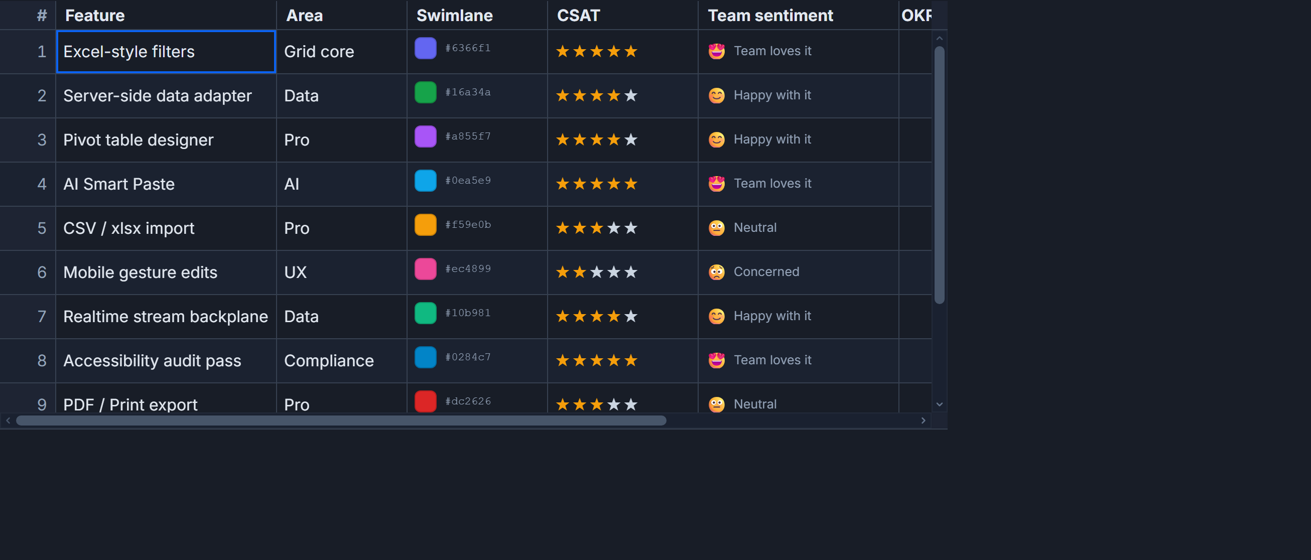 Autocomplete editing inside a SvGrid cell.
Start with the native option
Before you build anything custom, try <datalist>. It is a single HTML attribute away, screen readers already understand it, and it handles keyboard navigation for free.
<script lang="ts">
  import SvGrid from '@svgrid/grid'
  import type { ColumnDef } from '@svgrid/grid'

  type Row = { id: number; productName: string; category: string }

  const CATEGORIES = ['Electronics', 'Clothing', 'Home & Garden', 'Sports', 'Books', 'Toys']

  let data = $state<Row[]>([
    { id: 1, productName: 'Wireless Headphones', category: 'Electronics' },
    { id: 2, productName: 'Running Shoes', category: 'Sports' },
    { id: 3, productName: 'Garden Hose', category: 'Home & Garden' },
  ])
</script>

{#snippet categoryEditor({ row, column }: { row: Row; column: any })}
  <input
    list="category-list"
    class="cell-input"
    value={row.category}
    onchange={(e) => {
      const val = (e.currentTarget as HTMLInputElement).value
      if (CATEGORIES.includes(val)) {
        row.category = val
      }
    }}
  />
  <datalist id="category-list">
    {#each CATEGORIES as cat}
      <option value={cat}></option>
    {/each}
  </datalist>
{/snippet}

<SvGrid
  {data}
  columns={[
    { id: 'id', field: 'id', header: 'ID', width: 60 },
    { id: 'productName', field: 'productName', header: 'Product', width: 220 },
    { id: 'category', field: 'category', header: 'Category', width: 180, cell: categoryEditor },
  ] satisfies ColumnDef<any, Row>[]}
  editable
/>
This works well when options number in the dozens to low hundreds. The onchange guard (if CATEGORIES.includes(val)) is important - <datalist> does not prevent free text, it only suggests. Without the guard you can end up with an unlisted value in your data.
When the list is too large for datalist
Past a few hundred options, <datalist> shows a scrollable megalist that nobody wants to scroll. You need a filtered suggestion panel. The key state is a query string and a derived filtered list:
<script lang="ts">
  import SvGrid from '@svgrid/grid'
  import type { ColumnDef } from '@svgrid/grid'

  type Product = { id: number; name: string }
  type Row = { id: number; sku: string; productId: number | null }

  // Large catalog - imagine 5,000 items
  const PRODUCTS: Product[] = $state([
    { id: 1, name: 'Widget Pro' },
    { id: 2, name: 'Widget Lite' },
    // ... more items
  ])

  let data = $state<Row[]>([
    { id: 1, sku: 'A-001', productId: 1 },
    { id: 2, sku: 'A-002', productId: null },
  ])

  // Per-cell editor state keyed by row id
  let activeRow = $state<number | null>(null)
  let query = $state('')
  let highlightedIndex = $state(0)

  const suggestions = $derived(
    query.length < 2
      ? []
      : PRODUCTS.filter((p) =>
          p.name.toLowerCase().includes(query.toLowerCase())
        ).slice(0, 15)
  )

  function openEditor(rowId: number, currentName: string) {
    activeRow = rowId
    query = currentName
    highlightedIndex = 0
  }

  function commit(rowId: number, product: Product) {
    const row = data.find((r) => r.id === rowId)
    if (row) row.productId = product.id
    activeRow = null
    query = ''
  }

  function cancel() {
    activeRow = null
    query = ''
  }

  function handleKey(e: KeyboardEvent, rowId: number) {
    if (e.key === 'ArrowDown') {
      e.preventDefault()
      highlightedIndex = Math.min(highlightedIndex + 1, suggestions.length - 1)
    } else if (e.key === 'ArrowUp') {
      e.preventDefault()
      highlightedIndex = Math.max(highlightedIndex - 1, 0)
    } else if (e.key === 'Enter' && suggestions[highlightedIndex]) {
      e.preventDefault()
      commit(rowId, suggestions[highlightedIndex])
    } else if (e.key === 'Escape') {
      cancel()
    }
  }
</script>

{#snippet productEditor({ row }: { row: Row })}
  {@const currentProduct = PRODUCTS.find((p) => p.id === row.productId)}
  {@const isEditing = activeRow === row.id}

  {#if isEditing}
    <div class="editor-wrap">
      <input
        class="cell-input"
        bind:value={query}
        oninput={() => { highlightedIndex = 0 }}
        onkeydown={(e) => handleKey(e, row.id)}
        onblur={() => setTimeout(cancel, 150)}
        autofocus
        role="combobox"
        aria-expanded={suggestions.length > 0}
        aria-autocomplete="list"
        aria-controls="suggestion-list-{row.id}"
      />
      {#if suggestions.length > 0}
        <ul
          id="suggestion-list-{row.id}"
          class="suggestion-list"
          role="listbox"
        >
          {#each suggestions as product, i}
            <li
              id="suggestion-{row.id}-{i}"
              role="option"
              aria-selected={i === highlightedIndex}
              class:highlighted={i === highlightedIndex}
              onmousedown={() => commit(row.id, product)}
            >
              {product.name}
            </li>
          {/each}
        </ul>
      {/if}
    </div>
  {:else}
    <button class="cell-display" onclick={() => openEditor(row.id, currentProduct?.name ?? '')}>
      {currentProduct?.name ?? '(none)'}
    </button>
  {/if}
{/snippet}

<SvGrid
  {data}
  columns={[
    { id: 'sku', field: 'sku', header: 'SKU', width: 100 },
    { id: 'product', header: 'Product', width: 260, cell: productEditor },
  ] satisfies ColumnDef<any, Row>[]}
/>
A few things I find important in this pattern: require at least 2 characters before showing suggestions (avoids a jarring full-list flash on focus), cap the list at 15, and reset highlightedIndex on every keystroke. The setTimeout on blur gives the mousedown handler time to fire before the list disappears.
Fetching suggestions from a server
When the option set changes - user-created tags, live inventory - you need to hit an endpoint. The discipline here is the same as server-side pagination: debounce the fetch, abort stale requests, cache what you have.
// A simple debounced fetcher with abort support
function createSuggestionFetcher(url: (q: string) => string) {
  let controller: AbortController | null = null
  let timer: ReturnType<typeof setTimeout> | null = null
  const cache = new Map<string, { id: number; label: string }[]>()

  return async function fetch(
    query: string,
    onResult: (items: { id: number; label: string }[]) => void
  ) {
    if (timer) clearTimeout(timer)
    if (controller) controller.abort()

    const cached = cache.get(query)
    if (cached) {
      onResult(cached)
      return
    }

    timer = setTimeout(async () => {
      controller = new AbortController()
      try {
        const res = await globalThis.fetch(url(query), {
          signal: controller.signal,
        })
        const items = await res.json()
        cache.set(query, items)
        onResult(items)
      } catch (err) {
        if ((err as Error).name !== 'AbortError') {
          console.error('Suggestion fetch failed:', err)
        }
      }
    }, 220)
  }
}

// Usage in your component
const fetchSuggestions = createSuggestionFetcher(
  (q) => `/api/products/suggest?q=${encodeURIComponent(q)}`
)

let remoteSuggestions = $state<{ id: number; label: string }[]>([])

// Call this from your oninput handler:
// fetchSuggestions(query, (items) => { remoteSuggestions = items })
The 220 ms debounce is a reasonable default - enough to avoid firing on every keystroke while still feeling responsive. The cache avoids re-fetching the same prefix if the user backspaces and retypes.
Validating the committed value
One tricky edge case: what happens when a user types something that does not match any suggestion and presses Tab or clicks away? You need a policy. The two reasonable options are reject (clear the field, keep the old value) or accept (allow free text and let your backend validate). I prefer reject for ID columns where the value must resolve to a real record, and accept for tag-style columns where new values are legitimate.
The reject path is straightforward - in the onblur or escape handler, restore the original value from your data if query does not match a suggestion. Keep a previousValue variable around for this.
Positioning the suggestion panel
The panel renders inside the cell. If the grid is inside a container with overflow: hidden, the list can get clipped. Use position: fixed with computed coordinates from getBoundingClientRect() if you run into this. It adds a bit of complexity but is the reliable path for grids inside dashboards with nested overflow contexts.
Custom cell editors in SvGrid are just snippets, so you get Svelte's full reactivity and component model. The autocomplete pattern above - query state, derived suggestions, keyboard nav, commit on selection - covers the majority of real use cases. Start with <datalist> for simple lists, graduate to the custom panel when you need filtering behavior the native element cannot provide, and add the fetcher utility when the data lives on a server.